Friday, July 29, 2016

A Morning of Printing.

There was just the three of us today printing and rewarded ourselves with a nice lunch at local club.
A good time was had as usual with impressive results which new ideas sprung forth for a  later date in the form of a collaboration.
Here's some photos so far.
Playing with embossing on handmade paper.

Two more plates and embossed prints.

Handmade paper embossed print.

Inked plate with possible paper choice.

And the result on paste paper which left interesting marks because of the differing heights on the surface.


Off the press.

Decisions to be made before putting on the press.

This is very effective over the paste paper.


Ghost print minus the border.

Wednesday, July 20, 2016

Inbetween Carving and Printing.

Besides my two previously mentioned projects I am still finding time to continue on with the art deco/art nouveau colouring but sometimes the days aren't long enough as I still need to exercise, otherwise I get cranky. I can't imagine being bored by not having something to do.
Below are my latest ones just updated to computer.
I really enjoy using mixed mediums and have done one with pastel pencils in the centre image with soft colour pencils on the outer image/border.


1920's ART DECO DOOR..

ART NOUVEAU,BRUSSELS,VICTOR HORTA'S WIFE (top)ALFONS MUCHA'S WIFE (below)


CHANING BUILDING, NEW YORK.
Pastel pencils in the centre with soft pencil on the border. It has been sprayed with a fixative to prevent smudging.
This image wasn't one I favoured, it became a challenge  and now quite like it. Some time it's easier to "see" the pattern once colour has been applied.

SCRIBNER'S MAGAZINE COVER,1897 by MAXFIELD PARRISH.

ALFONS MUCHA,CZECH.1860-1939.
One of my favourites.
The book is nowhere being finished as some designs don't attracts me at first so I treat them as challenges and spend some time considering colour choices and materials. There is always the question of balance too in regards of how much white background to leave and where to place the dominate colour, palette and tonal values.
Some pages have twin images so I take the chance to either paint as one or use complimentary colours even change the colouring of a background in one and leaving white in it's twin.
ART DECO JEWEL.
This is the twin or mirror image while below is same colours but in different positions. There is so much one can do with one image.

TIFFANY.

In the back of the book a page has details of the images such as a building somewhere in the world and also includes details of the creator of a piece of jewellery, a fence gate or just a mosaic design from a floor, wall or tiles.

AR DECO MOTIF.
And some are only motifs but always nice to work on.

I had these two in a previous post and CHARLES RENNIE MACKINTOSH is a favourite.

DIAMOND and PEARL NECKLACE by RUSSIAN ARTIST  ROMAN PETROVICH TYRTOV,ERTE.
I imagine only the very centre piece would be the actual necklace.


Return to wood carving.

Now that school holidays are over I 've returned to wood carving and am on my second piece again in Leichardt. A soft yellow wood makes it easy for learners to carve and this time I'm not as ambitious as the first large project and one of the other ladies sketched a flower on an odd shaped leftover piece.
The intention was to be gentler with the timber and not leave gouge marks which are harder to sand off by hand later.

The odd shape and if you can see it there is a likeness to a human head as it was an off cut from a piece one of the other carvers who is carving a portrait.


Side view and it won't stand erect on it's own but that's okay as still a learning piece.

Notice the sun coming through under the branch and this is what I have learnt lately, how to reverse the tool to round off edges and smaller tools to "dig".


The depth cut away from the base.
Carving like any art related project takes love, care and time to produce a piece to be proud of.
I probably won't carve anymore away as don't want to break a petal even though it looks secure and strong it would only take the wrong pressure and a twist to the tool to create damage. Sanding will be a slow process and a coat of varnish this time to bring the colour out.


I went for an early morning walk in the Botanical Gardens and this is the Leichardt tree in it's natural state.


Art, friends, food no wine yet!!

It has been a staggered process this year with my ladies group , they are travellers too and come home with good ideas to share. That's what it is all about for the five of us . No high expectations or pressure but plenty of encouragement when learning something new. I had never until I met them tried hand made paper making which was fun and led me to an idea which I have yet to put into practise, one day! maybe next year but plans have already been tossed around for 2017. Also tried alcohol ink printing for the first time and loved the vibrant colours.

                                              
Positive and negative and I will use them both in time and the negative as a stencil


                                                            Hand Made Paper.

                                    
This is my hand made paper with strips of paper added while still damp but found had to be pasted down to use later.
Experimenting is a great way of learning as I guess anyone reading this would already be practising and this was an embossed leaf straight from the garden onto hand made paper while damp.

BOTANICAL THEME.
For the books we are making a botanical theme has been chosen for some images and here are some prints from nature using coloured paste(paste paper) leaves of varying types and we are progressing through various artistic styles, mixed media. At present we are concentrating on my first love of lino cutting and printing.

A coffee (actual coffee to tint the paste) with the same leaf in another medium.

Bringing another colour into the design and presenting another texture as well. None of this is planned before hand so very spontaneous work.


This leaf was sprayed with an aerosol ink as a stencil.


Still With the Coffee Colours.


Feathers were also used for comparison and I love printing with feathers. Some nice pages here and can be used as part of other images as well, collage etc.

Planning on newspaper before applying ink to leaves for printing.

This is a really nice selection.

Coffee, dark ink and even some white. Printed on paste paper background.

COLLAGE.
Each lady has the morning to demonstrate and "be the tutor" but we nearly always end up swopping ideas and putting it into practise.


This is influenced by travel.

More colourful and friendship is the keynote here.

RUST PRINTING.

I experimented before we used good papers and hubby's old camping frypan came in handy and added tea blended in nicely, as does coffee!

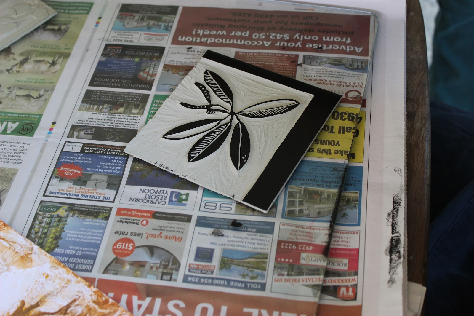
LINO PLATES AND PRINTS.
At present this is an ongoing process, yes some have been travelling, sailing and generally having a good time. Not all plates have been cut and this Thursday there will be more done so added later.

A small plate and since changed adding marks to the gumnuts and the edges cleaned up.
This one is planning a new plate of a lotus flower from her Sri Lanka holiday.

Last week we visited a friend and borrowed the use of a small printing press as an introduction to printing and how a press operates. I like this print but naturally coming off a press was greatly improved as this one was hand pulled and I 'm out of practise! The backgound will be changed in coming  weeks just as part of what you can do to an image. And of course  I will be stepping back at the next printing day and letting them set the pressure , blankets etc. themselves.
After the printing session we had a lovely relaxed lunch at a local club across the road and the ladies shouted myself and friend our lunch and drink in appreciation for the day.

Monstera Delicious Leaves and lovely large leaves for a beginner. 

An adapted image from a art deco colouring book.

First idea was printed over a print lifted from the glass mixing plate but is a bit lost on the lower left corner.

Printed it again in this lovely red and cut it out to place over the background, below which looks better but not yet decided if it will be the final decision.