Back in July I wrote about a group of ladies meeting each week to practise a shared interest in book making. Some for personal use and others as gifts.
Yesterday I finished one for my friend who resides on Karraggara Island.
Decorated Pages.
Some pages were decorated with pieces of my own artworks, old prints, marbling and a piece from recent book just finished. There has been many pages left for text and her own drawings.
The cover was brown paper with a piece of Japanese paper and the end covers from a drawer liner which matched in nicely with the colour scheme.
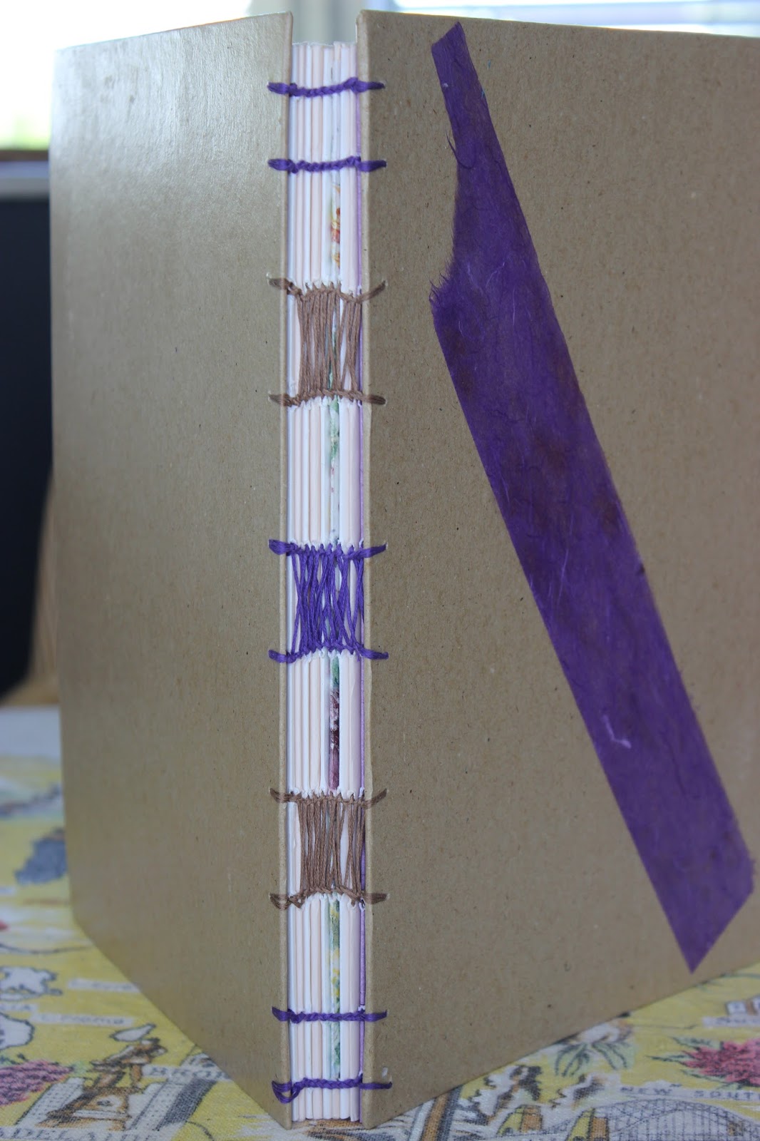
My Book.
Book number 28 and decided to experiment with two colours in the stitching and colour scheme used throughout the pages. This one has 23 signatures and is second to my other art journal for my ideas and projects.
Book 28.
The one underneath was made in 2008 and the cover was another experiment with fabric.
Cover for no 28.
Front cover, an old experimental print I had read about.
Marbled end cover, front.
Back cover and again an at home session.
It has been interesting to use and recycle old pieces, to work out colour combinations and for me there's always an alternative and a use for old projects, they become positives.
My next project involves timber and carving drink coasters for the end of year club display, family gifts etc. Purely by accident as hubby was cutting some Mackay Cedar and I happened to mention the size would make nice drink coasters. Then he discovered some Raintree so now have mixed colours in a set.
Mackay Cedar unvarnished.
While I am on this subject I will catch up with my carving tool kit lid .Designed, pyrographed and varnished. This was my first pyrograph project and quiet an enjoyable and relaxing experience.
One of the chaps in the craving group offered to give me the box as he had made a few and he also made the new handles for the carvers as when the kit was bought it was only supplied with a short round handle and the longer handle is better to work with. It's styled in the old fashioned pencil case with the slide on lid, brings back memories of school!
Combining two interests.
Now I had the bug to pyrograph drink coasters for my lady friends as a thank you for inviting me into their homes. So I have a set each with two coasters, one for their hubbies and one each for the ladies but there's has their own design from their books we made, a little bit more personalised. The images were lino prints(apart from the leaf as an actual leaf was used for her book print) for their books. These are burnt onto the Raintree as a lighter coloured timber..
The daisy was drawn freehand for the lino plate and I added a bit of white paint for highlights.
The feather with a highlight as well.
Palm trees.
An actual leaf print for her book.
Aussie gumnuts.


