Friday, November 22, 2013

Third and fnal poster

Here is the final one for this series and I enjoyed the challenge of designing ,personally I don't feel it's a strong point  but I kept in mind size in relation to each object and the fact that I expect young children to understand the drawings enough to find them interesting in the negative and positive spaces. They will create their own marks with whatever materials they use for colouring.
All posters are 500mm x 325mm , approximately half a sheet each.

                                                             
Third poster.

Tuesday, November 5, 2013

Exciting News

Earlier this year I entered the Printmaking Sisters Animalia International Print Exchange and today an e-mail was sent out to participants and members with a News Flash (quote),
 "The National Gallery of Australia  is to house the Animalia International Print Exchange Collection permanently in their archives following the exhibitions in Italy and USA. From August 2014 onward the collection will be available for viewing by appointment at the National Gallery. Congratulations to all the participants."
(unquote).

I also bought the poster which displayed all the prints and I was very impressed with the variety and quality of the prints so my congratulations to all involved.

Wednesday, October 30, 2013

Playing with Posters

When my children were younger I had bought two large posters to colour in, good for bored or rainy days. We had so much fun and what people call "bonding time " these days  I decided to make my own for my grandchildren. I know my children still have theirs and I had them laminated.
 I don't know yet when I will present them to the grandchildren and I will also supply colouring materials too.
Deciding on the subject matter and design I kept in mind areas to create interest in shape and form using large and small areas but to have a challenge to use their colour sense as well and this also lets  them create marks, adding another dimension.

 
First poster.

 
Second poster.
 
Butterflies are the possible third subject as I have two boys and one girl.
 
My original idea was to carve and print from a lino block , which I still can do "one day" but as lino cutters would know there is a lot of cutting away large areas to create the fines lines.
So I decided to do as drawings with archival, waterproof  and colourfast inks.
 
Now it's time  to move onto the third poster and in the back of my mind ideas are forming for maybe doing some for other family member's grandchildren?

Wednesday, September 4, 2013

Birthday Favour Bags

My grand-daughter celebrated her seventh birthday recently and mum chose the "tea party" theme complete with silver tea pot and nice crockery. The girls dressed up for the occasion in hats, boas, make-up and had their own cubby house.
 I , while in the bag mood bought some nice brown paper and made the favour bags and decorated them with pretty paper leftover from the invite pad.
Leftovers are so handy and used some paper tie for the handles and finished them off with two metal tags , one with "thank you" and the other with "love" on them.
Pretty in pink tones.
 I also made paper necklaces as a gift for each of them.
 

Project Number 2

A group of twelve members signed up for this project involving the Botanic Gardens for an exhibition titled "Diversity in Nature" :-Special plants of Mackay and the Whitsundays.
Each artists was allotted a plant and written information about the plant and we were allowed to create a print in any medium and style.

I chose a double plate print with the background developed from a vinyl lino plate and the main image from normal lino but smaller. 

This isn't how I loaded these  as the one below is the vinyl lino already cut and the print here.


Lino plate ready fro printing.

The finished image and I liked the two different colours.
The large veins  for the background are indicative of their life giving energy. My plant is the Mt .Blackwood Holly which  has a lovely trumpet shaped flower of the most beautiful cerise colour. The leaves and the sticky type stems interested me and the points on the leaves are so defined.

Something Different

It's not because I have been 'resting" from art projects , I had a medical family situation to attend to and am now just getting back into concentrating on new projects.
Before this I did have an amount of work done with another in the wings. Earlier in the year I was involved with an art market as a member of a printmaking group . We worked towards  sharing a stall at the September market so being inspired  I felt it was a good avenue to recycle some old prints etc. I dismembered an old paper bag for my template and made 8 carry bags , some slightly larger then a couple of others. As you know what happens one thing led to another and soon found myself making all sorts of tags to put in them. Anything from book marks (8), post cards(3) with hand drawn posting address info. on the reverse, to /from cards(1), gift cards (6) and one original cd size print from a previous project.

 
A sample of the cd prints.
 
 
Old portrait prints for library book marks, being sorted so no bag receives the same colour or shape.

 
Selection of the postcards. 


More bookmarks or tags the purchaser can use for whatever is required.

 
Sorting details again.

 
I "wrapped'" the bottoms to prevent then from falling out should someone pick then up to look at. 
 
 
Presentation of contents for the bags.
 
This is only three of the bags with the two on the right being my own prints  and the one on the left was a leftover paper from my last book making session. Unfortunately due to circumstance beyond my control it was cancelled.


Wednesday, July 3, 2013

Experimenting Can Be Fun.

Over the last two days I have been busy with my Gelli plate and moulding paste. I read about this technique on Gelli Arts site so decided to have a go, nothing tried, nothing gained.
I made my own stencil from an old notebook's cardboard back and sealed it with shellac as I did with the two plates.
A simple window design.
Love that texture and I wasn't too sure how much paste to use so I was flying alone here but the instructions said a thin layer.
These still have some colour on them which was good to photograph as they are white substrates.
I really enjoyed playing with the paste and intend to use at a later date for a more serious image.
 
 
These won't be in any order as per print run . I do like this one and I also used a embossing tool to pick up the ink on the base of the plate.  This one's a keeper as I will use some in other projects, more on the craft side. 
In some of them I have overlaid the image as well as the colours, the beauty of having more than one plate. At this stage ideas were rumbling around so I was trying to keep up with the inspirations.....
Darker tones with this one and I kept the stencil in place while printing.
By changing the inks and images and ghost printing I came up with this beauty, another keeper.


A brighter and clearer colour in this one and I soaked the paper too as I normally do for oil based inks. I must admit to not having good results with the acrylics so switched to  the oil based inks .
And the final one which is growing on me as very hit and miss printing.
 
There will be more experimenting in days to come with this method so I hope you all enjoy reading it and plan to give it a go.

Saturday, June 8, 2013

Ten Years of Printmaking

I belong to a group of people who love printmaking and we celebrated our tenth anniversary this year. I hadn't realised that the exhibition date was looming so fast and after the meeting in April I had to print up an image developed from at least two other plates from the last ten years and any new members could use a new image.
This was the quickest print  I have ever pulled in all these years , so little time to play with thoughts and images. I grabbed an old collagraph plate for the background, slapped some ink into it and printed that then inked up an old favourite plate of a duck in darker ink and run that off.

Only the best of the three I printed was worth a frame so once that was dry I took it to my framers and to this day the print is certainly one of my favourites. But one can't hang onto them all and as one of the members enjoyed it she offered to swap or buy it and we have yet to agree on it. I had a not for sale sticker on it as I do love to live with them for a while but common sense must prevail and I know it will go to a keen collector and printmaker.

The background was from a commission I had done a few years ago and the lino was for another exhibition in 2012, you may recognise this duck as it is the centre one which has sooo much attitude. His photo was taken when we visited Tamworth Festival a few years ago and had been resting under the trees and seemed to be giving me the "how dare you disturb us look".

Enjoy..


P.S I have since reprinted this in greener tones and have two there that I like as well and will possibly be included in my next project.
 
I was exceptionally pleased in it's hanging position during the exhibition as it was hung with two other lovely prints in similar colours and sizes.

Ladybug Print

Early this year I printed these Ladybugs in compact disc size which I find easy to work with at home and fun to do. I used the reduction method and I enjoy this technique, keeps the brain working  once I have decided on the image.
These are for the  Printmaking Sisters Group based in Sydney.

 
Applying the reduction method

 
Because I didn't previously cut the dots out of the first plate I cut another plate and printed a run of black and white, just because I liked the image.
 
After printing the red colour I proceeded to print the yellow  and I knew it would change the leaf colours and that is what I like about reduction.


While the dots picked up the green ink which turned the leaf a lovely chocolate colour I did a run of black for the dots as the final colour.
 
I was having such a good run and working with my own system I just kept printing and at the end of the day put aside to dry.
 
 
My makeshift drying rack sitting on a trolley which holds my papers and I stacked old drawing boards on top of paint tins and solved the problem as my studio isn't large.
 
Next day I  had to reduce the lino again so went ahead with that and cut the background away but when I wanted to print the final colour I thought I was short in how many I had done. Of course found them and realised I would have to just keep going and printed these minus the yellow background.
 
 
It was rather pleasing to see how images can change due to errors and I much prefer the chocolate ones, who wouldn't !! 
 
 
So whoever receives my set of prints I really do hope they make you happy.
For the leftover prints from this project and past ones I have an idea brewing to make use of them, more on that in the future.


Saturday, March 30, 2013

Libris Awards List

Well we have made the short list so to speak and I recognise a few names , locally and interstate so I am excited about the chance to view some beautiful books.
It makes the effort worthwhile to have put the hours, ideas and time into something challenging.
I shall keep you posted re my impressions, which I fully expect will be amazement as I have been so impressed with the works from artists in the past with B.A.O. and Libris entries , always a learning curve to view these pieces.

Friday, March 29, 2013

Working on Libris Award's entry

Hello everyone I have returned from a holiday and this piece was finished before I left.
A group of likewise artists have been collaborating on an entry for the Libris Awards this year.
The few rules we followed were to have all the covers the same colour but toned to blend together. Each member was given the choice of their bottle of paint which had been previously tinted either way, (darker or lighter) and a box was created to hold each individual book according to it's size with the understanding that they must not rest above the box as the box is a tiered design.They must be easy to remove from their sections for the viewer's pleasure to read. Also there was not to be adornments of any sort on the cover of the book, just plain simple colour.
Meetings were held along the way to check on our progression and this gave members a chance to make any corrections , such as myself when I had to make at least eight slipcovers before I was happy with the result.
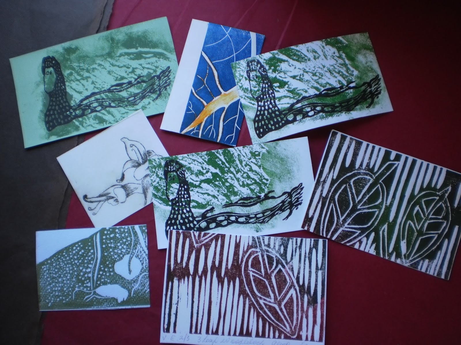
However onto some photos I took along the way.

The first step for me was to make a dummy book to try my idea first.
 I especially wanted a spine "laced" with satin ribbon as my subject was corsets.
So far so good and I was bearing in mind the tightness of the ribbon on opening the book as I wanted it to lay open flat.
Now the exciting part starts to happen and as I knew I had various papers from other experiments and projects and with the mind whirling with ideas I bought some nice scrap book papers to compliment my own. I also wanted to do art works and not necessarily prints but felt that should be included.
In the meantime I was researching the history of corsets and had made the choice to not let that overtake the book itself so kept that to a minimum.
The following are some pages and I did keep them in their historical order as per year.
This was one I made early on so possibly not in order here. The ideas didn't always come to me in any ordered way, I let it grow and happen as it wanted .
 
 
Even though I am a printmaker/ water-colourist I didn't want to just use paper the texture of fabric was important as not all corsets were made from satin or silk. The working class woman wore cotton corsets. The original corsets were made form whale bone and other 'hard" materials so would have been very uncomfortable to wear and produced bruising. This page represents the higher class lady 's corset made from satin and adorned with nice ribbons,laces and buttons.
A" filler" page and this had been one idea for the title page but decided to use it elsewhere.
"Filler pages" were used to "bulk" up the book to height requirement and create interest.
Another example  and I attempted to place each one in a position to bind a story.
Ahh! one of my favourites and really enjoyed this page.
A preview of how the pages would be presented in the book.
This is one towards  the end comparing the differences over the years and how they were being worn outside of the clothes as a fashion statement.
This is another special page and the corset is a cut-out and the reverse of this page has historical information for interests sake. 
A drawing to show how the corset can achieve elegance to fashion. Each style of corset
could produce a certain effect to the ladies outfit. 
The end papers which I dithered with for a long time as needed to get it right. I tried images from the book itself but instinctively felt it wasn't right so rummaged around and found some marbled papers I had done a few years ago. It pays to let ideas lie , sleep on them and hey presto it happens.
 
The finished book and I did shorten the ribbon as proved to be a bit bulky for the slipcover.
   Open position and happy that it wasn't pulling the pages and making it hard to turn them.
Finished spine.

 
Slip-cover number eight which had to be remade as the curved edge was considered adornment so number nine hasn't been photographed. 
Because of the ribbon spine I had to make the slip-cover with soft "walls" and firm top and bottom.
 
 
Our entry has been presented to the selection committee but I haven't heard if it has been accepted yet.