Thursday, June 14, 2012

Woodblock reduction:-post Jill O'Sullivan workshop.

Finally I spent the best part of yesterday cutting away probably over half of the image which I had previously used in the woodblock workshop.
Registration was my biggest concern, as it is with a lot of us I think, and out of the four prints I had run off at home by hand  I have decided there is one reasonable print.

The one "good" one. 


and one of the "others".


Sunday, May 20, 2012

A short experiment.

Today I decided to expand on the last post with a short experiment printing the reverse side of the wethertex woodblock used in the workshop. Not wanting to cut into it yet I inked it with two brayers
and two colours and applying light and heavy layers of ink.
This is the reverse side of the woodblock free of ink.

I like the two colours I mixed and it has possibilities for future use as a background or in collage.


Monday, May 7, 2012

Woodblock Workshop with Jill.

.
A small group of five ladies united for this workshop. Jill travelled from Townsville ,about a four hour drive north of Mackay to conduct the two days .

 We started at ten am both mornings and worked through until 3.30 at least before cleaning up to go home. I went home very happy with my efforts , I had muddled around with woodblocks at home previously but it was great to have a professional "on hand". Everyone had either a drawing prepared or at best an idea to work with. Books on printmaking were readily available to peruse while enjoying a break. Stories about our experiences and information was swapped as we worked alongside each other.

Jill describing many ways on using the Wethertex woodblock. Apparently it is made in Tasmania ,the only place in Australia to manufacture it. It can be used inside or outside the home. One side is smooth and the other was in it's natural state re texture which you can work both sides.I have wondered about a pin press and had researched it in the internet and there it is in the foreground. Very good tool for printing on fine papers and it will give you a bit of a workout too! Getting the pressure right for each type of paper is essential for a good print.
Another new experience was the use of the Dremel, an electric drill and Jill is demonstrating it here. I
found it to be a very concentrated exercise and the use of a mask is advised , you know the usual "drill" for health and safety. Different types of drill bits will produce varying marks/lines and handy to have around especially for large areas.
My drawing on the first block. It was of a local creek I had visited years ago and thought it would give me the chance to develop different marks.

The "nest" for the woodblock to sit in to be printed. The block needs to be supported in this way so that the pin press has an even surface to roll over. The paper of course is laid carefully over the top and a gentle but very firm pressure applied to the pin press, working from all sides and checking as you go. (This is where you get your workout).
Printing with the pin press.
My first pull of the creek and now I can make changes to the plate.
After discussing this print with Jill I cut more out of the creek. I was pleased that I had thought to not cut too much away in the first cutting as this gave me the chance to change the image.The image was growing on me a bit more now as I am not a landscape artists. 
This is the print from the changed block, much nicer!!


I took the block home on Saturday night and changed it yet again by cutting away the small rock in the right hand front corner (of the block) and accidently removed a part of the larger rock too! Oh well , it happens... I do like this and can now handpaint the creek with watercolour in the next edition run. I could make the block as a jigsaw too but I managed to ink the whole block using two rollers.
Sunday 's effort.
Being one who likes still life I had this next image drawn up ready in case I didn't like the creek image, nothing like being prepared.....Ther block is very easy to draw on with pencil and easily erased with an eraser if need be.
Second drawing for Sunday's session. I started cutting a border around it early Sunday morning as had to work out my light next to dark routine.
Partly cut block for Sunday which I finished in the morning.This particulr woodblock has a tendacy to chip so the reverse side wouldn't have that problem as it doesn't have a coating but you would need to work with it's texture.

We all feel in love with this particular colour, apparently the ink is 40 years old and is called champagne ink whic is very silky to use , a bit thicker than what I am used to using so another skill was learnt to be more light handed.I like this block and has future potential too.
Sunday mid-afternoon playtime.I had pine block so played around with that and to use up the excess ink we enjoyed  playing with our blocks on brown paper. This is on white and have definate ideas about this image. In the end my style of cutting was more suited to the pine block  than the wetherboard as I like the clean cuts in produces as with lino.


Friday, April 6, 2012

Umbrella Entry for 2012

This is my third entry for Umbrella Studio in Townsville where each member submits three prints the same size as a compact disc case. One print is enclosed in a case for display, one is for auction to raise money and the other goes to a swap between members. It is always exciting to receive your print and to know who has received yours.

This one is of one of my grandsons visiting the chooks down our back lane which used to be a railway passage into town which has been removed and is now a pathway.
Since I became a Nana it is our habit on babysitting days to go for a walk along this path.
Printed on Fabranio paper from a lino plate with hand painted on the clothes.
                                                                         

Visiting the chooks.

I kept the design simple with just some areas of the wire fence and gate included.

Thursday, February 23, 2012

Swapping Margaret Olley.

As in my previous post I was talking about the group I belong to and the yearly swap we do.

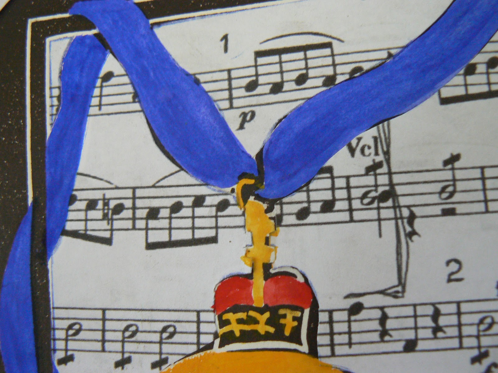
The theme this year was a tribute to Margaret Olley and an obvious choice of subject would be still life.Too easy so I decided to avoid that and approached the trusty computer for more information. I came across the Companion of the Order Medal, there was my subject. So settle back with a cuppa and enjoy your well earned break.....

I put into action the artistic license we all share and chose not to add the Mimosa springs on the ribbon, now there was a challenge which I don't mind from time to time but that was pushing it a bit!!!
One of many drawings.

 A couple of changes have been made, moving on, decisions, decisions.


I think there is something happening with this one even though I like the other one.Maybe I can use it for another project later?


Working on some finer details, do I want the background one colour, the leaves hand coloured or not,
 how much detail should be included?


And this led me to thinking about the border,soooo many ideas to contemplate.

Decision is made and here is the lino plate. Nice and simple in design.


Okay you haven't fallen asleep have you? Maybe you had better get another cuppa. This is a quick  hand pulled print with one idea of where to apply that colour! Don't worry changes are ahead.


And again new ideas forming as I progress. I do like the musical notes , no I don't know the first thing about music , just what I like to listen to. They have a certain quality about them.


See how one thought leads to another. What about calligraphy and use her name so off to practise my calligraphy, which meant I had to consider the size and where will it appear behind the image and how to get it there?

Starting to really develop this piece and can you imagine putting sprigs of flowers on that ribbon?
The size of the prints doesn't change from year to year, one of our conditions . It is the A4  size which means the ribbon isn't especially wide,well not to add sprigs onto....

After having chosen the background under the ribbon and medal it was time to cut away the excess paper.


Nearly finished , just have to cut 15 more prints as it was an edition of 16, the biggest one we have produced for the swap.

Presenting the finished print and I am happy with my choice of not colouring the leaves as it has made a nice contrast to the medal which is the focal point.

As I mentioned in the beginning about still life  I still wanted something to indicate that Margaret was an artist hence the frame and included the gum leaves as the Australian native symbol.


Friday, January 6, 2012

Swapping prints.

I belong to a group of printmakers and each year one member of the group selects an idea or subject , there could be a variety of choices and a vote is taken to decide on the subject. This  is to be printed by the end of January for presentation at the AGM in February. For a small fee to help the group financially members are required to print an edition of as an example 13 prints which includes the first of each  persons print going to the group's own collection. It was agreed to keep the size to A4 each year.
For as long as I am prepared to continue printing in this manner I will always collect number 8 and should I decide not to participate each year then my number goes to someone else. As we break for two months over the Christmas period it is good to have something to work on and to keep the hand in.

Our first swap , year 2009.

Printbank Mackay Inc. first swap collection and edition of ten. Portraits was the chosen subject and I eagerly awaited for my collection and it is interesting to see so many different styles and mark marking.


YEAR 2010

First bundle for year 2010
My subject choice was voted in this year so I decided to present them with a challenge of sorts.  Naturally the size was to be adhered to but colour's and medium were a free choice of the printer.
To help create interest I limited them to three objects from the kitchen only with my choosing one item that was to be included somewhere  with the other two as their own choice. My choice was a grater as  I like the shape and every possibility of texture could be applied. I have photographed these in three bundles due to more participating.


Bundle two and it is nice to see plenty of colour.

The final two for this year.


YEAR 2011
First bundle.

This year tree trunks was the voted subject and once again great one for texture. So many different shapes to trees as well.

Final few for trees. I like the colours , shapes and the embossing on some is a nice touch.


And for year 2012 we are all working on a tribute to Margaret Olley. More on that later.
                                                                            

Monday, January 2, 2012

A brayer has two uses.

In response to a question of how I apply ink to the plate here is I hope some helpful information.
I have set out the tools etc in an effort to make it a bit easier to follow.I thought it might be better to approach it from a "starting point".

A variety of spatulas  or palette knives for smoothing the ink on the glass plate.


Two brayers I use a lot. These two are strictly for inking the plate as I have an older one for "printing".


Three tools I can use to print with. Left to right ,my brayer for home printing, top right a proper baren metal base and lower front a bamboo baren. It depends on the paper quality and weight which one I use . For Japanese or lightweight paper I use either one of the other two and heavier paper  (like photocopy, cartridge drawing paper and lightweight Fabranio papers)  I use the brayer as I can get more pressure with it. I do have the use of  friends press for exhibition pieces.


The glass palte , from an old unsed fridge! any glass will do so long as it it reasonably thick similar to plate glass available from recycling centres.


From left to right ink, bottle of burnt oil for thinning the ink, in very small amounts while mixing on the glass plate. Talum powder can be added if too oily and runny to thicken the ink, again adding very small amounts to get concistency right. Vegetable oil to clean everything , knives, plate, glass, brayer  etc. with newspaper followed by a clean cloth. Some times I do a final clean down with turps but I like that the oil keeps materials soft.


Palette knife ready to spread and smooth the ink prior to inking the plate.


This what to expect your brayer to look like when you start picking up the ink.


A fully loaded brayer with ink. Listen for the soft whisper as you roll the brayer if it sounds heavy and feels sticky and forms little peaks as it rolls it's too thick.


Inking the plate in layers of ink and taking care not to overload the ink as it will fill the grooves which will print as white.Make sure the plate is covered evenly and corner to corner, edge to edge depending on your design.


The end result and this plate is showing cuts in the lino and a piece of cotton thread glued onto it which will print differently to the cut line. Because the thread is raised it will pick up the ink off the brayer and prints with a white edge around it rather than a fine white line with a nice sharp black outline. I haven't printed this plate .